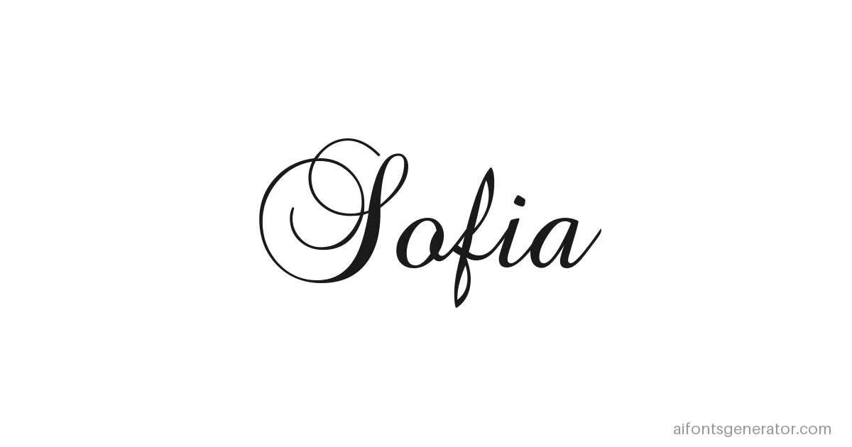
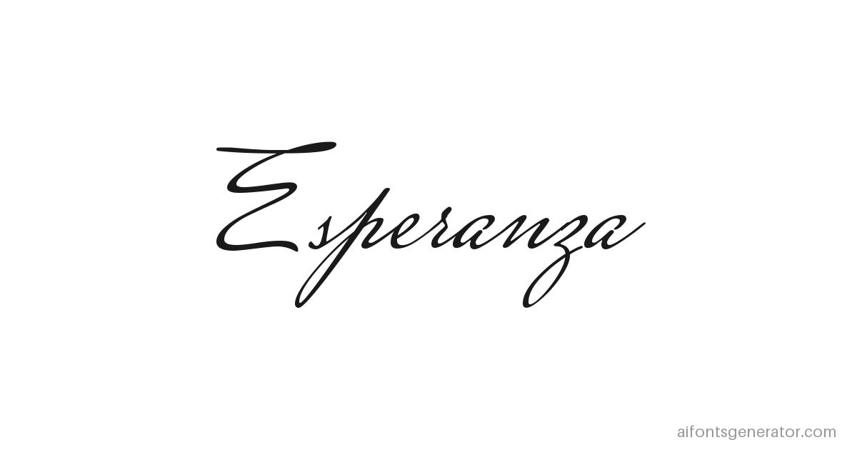
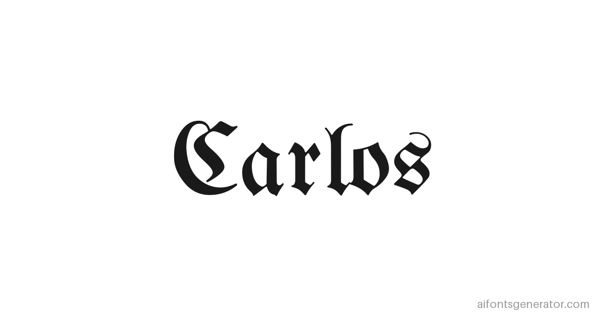
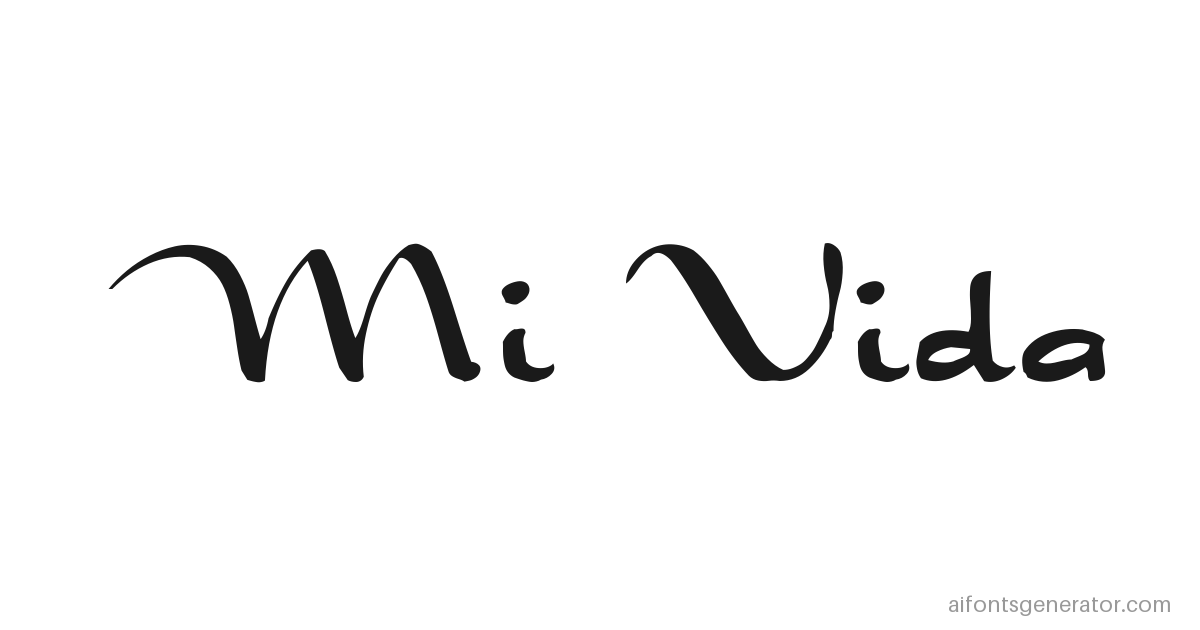
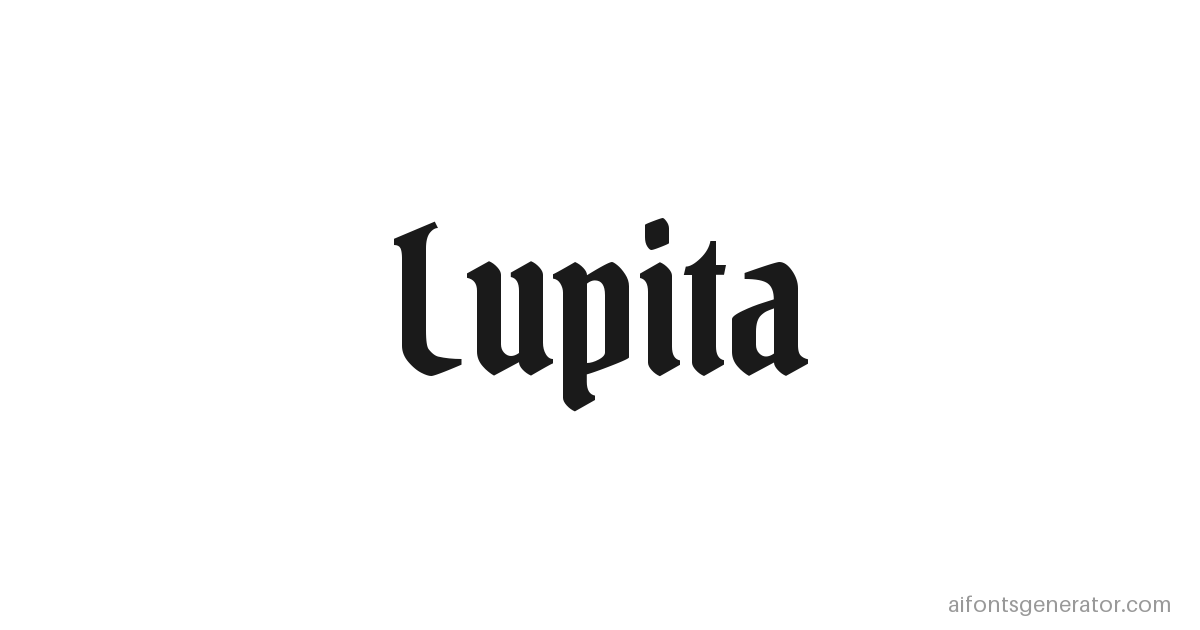
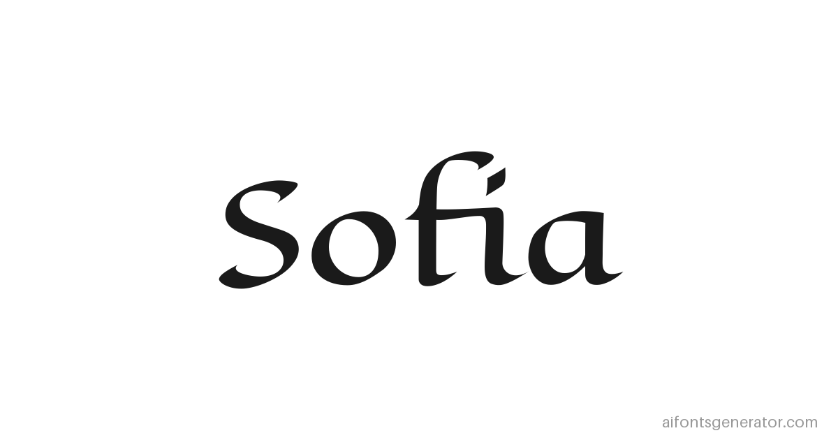

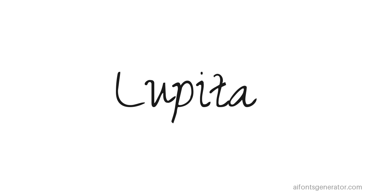
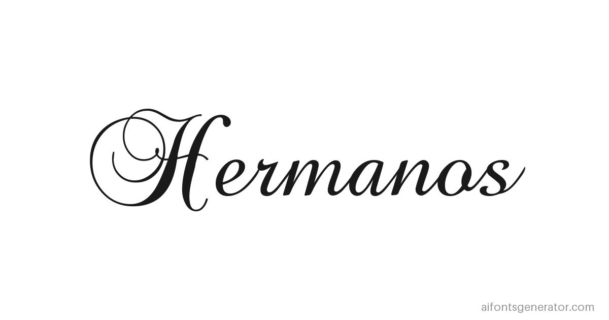
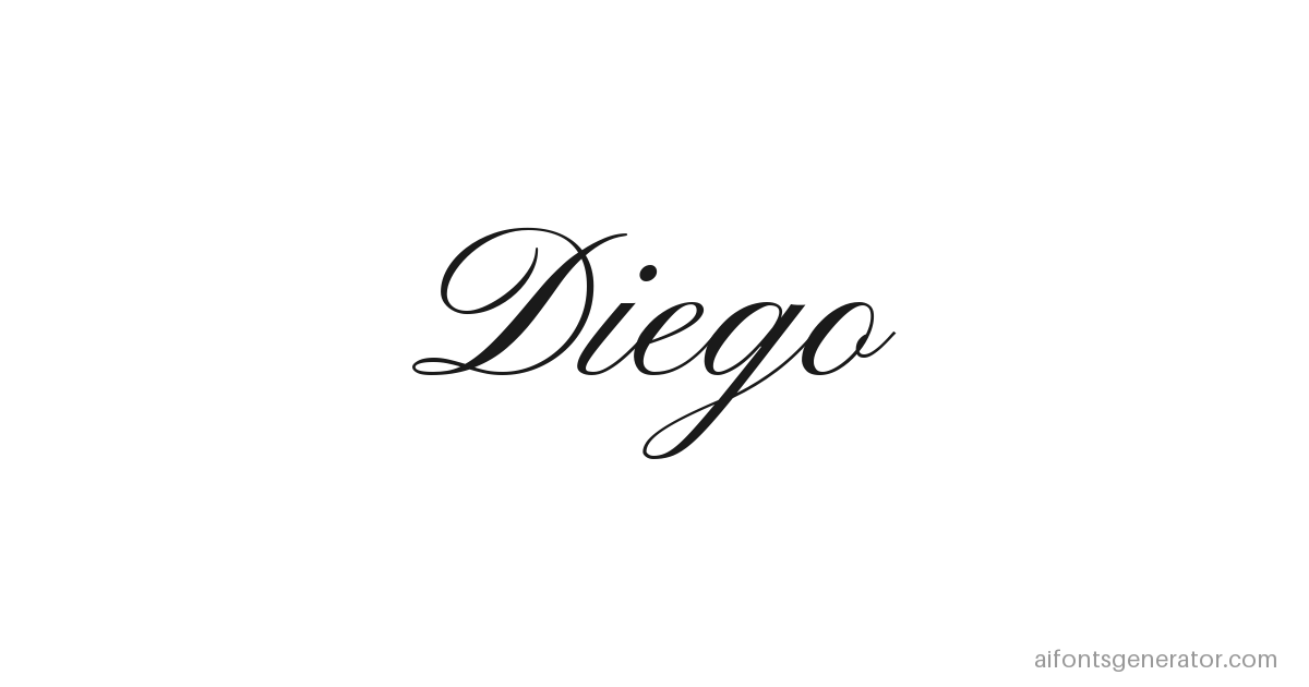
Marcus had the tattoo picked out eight months before he booked anything. His daughter's name, Sofia, in chicano script, running along the inside of his left forearm. He knew exactly what he wanted. He just could not show it to anybody.
By the time he asked me about it he had a Pinterest board with forty saves on it. Screenshots pulled off Instagram, mostly. A memorial piece for somebody's mother. A shop flash sheet photographed at an angle. One shot of a guy's ribs that he kept going back to because the R was perfect, and there is no R in his daughter's name.
He sent that board to three artists. Three sketches came back, none of them matching the thing in his head. The first was too heavy. The second was too clean, closer to a wedding invitation than a forearm. The third had the right feel but the artist had spaced the letters wide and the flow disappeared.
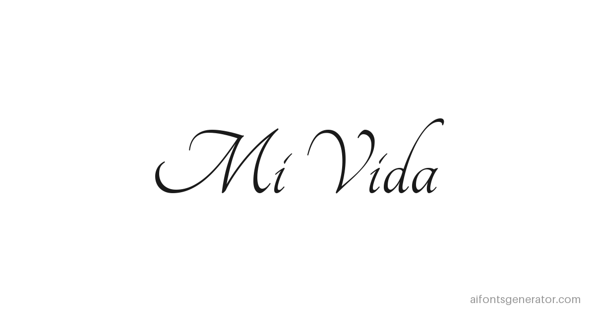
Here is the part nobody mentions. Every reference on that board was somebody else's name. Marcus had spent eight months staring at the word ANGELA and the words MI VIDA, doing the math in his head for how S O F I A would sit across five inches of skin. He had never once seen his own daughter's name in the style he was about to pay for.
That is the gap. Not "I want chicano lettering" but "here is exactly what SOFIA looks like in chicano lettering." No Photoshop. No waiting three days on a mockup. Type it into a chicano lettering generator, look at it, download it.
What chicano lettering actually is
Chicano lettering came out of Mexican American neighborhoods in East Los Angeles, roughly the 1940s through the 1960s. Pachuco culture had its own clothes, its own slang, and its own handwriting. The handwriting stuck.
It grew up alongside two things. One was lowrider car culture, where the same hand that pinstriped a hood would letter the club plaque and the shop window. The other was prison correspondence. Men serving time wrote letters home and drew paños, handkerchiefs illustrated in ballpoint, usually blue Bic because that is what commissary sold. When your only tool is one ballpoint on cotton, you cannot build a letter out of solid fill. You build it out of line, and you get elegance through control and repetition instead of through weight.
The same constraint shaped the tattoo side. Traditional chicano work runs on a single needle, which lays down a thin consistent line and almost no shading. Flowing script and fine flourish suit that tool. Heavy blackout does not.
Said plainly, this is a living art form belonging to a specific community. A font preview gets you a starting point. The artist brings the tradition.
The style splits roughly in two. Chicano script is the connected cursive most people picture first, with long entry strokes and thick to thin transitions borrowed out of copperplate penmanship. Chicano blackletter is the angular dense side, Old English at the root, run through decades of Mexican American tattoo and mural work until the proportions stopped being European.
How to use this chicano font generator
Type a name into the input at the top of the page. That is the entire setup for this chicano script font generator.
Every style below updates while you type. Eighteen fonts across script, blackletter, ornate, and fine line, each one rendering the exact letters you entered instead of a sample alphabet.
Pick an ink next. Classic Black is what most traditional chicano work uses. Blood Red shows up on memorial pieces and on lettering meant to read as a rose or a wound. White Ink renders the way white ink actually behaves, subtle to the point of nearly vanishing, and it is better to learn that here than in the chair.
Switch the background after that. Paper gives you warm Bristol for a clean download. Flash Sheet puts faint graphite construction marks behind the letters so it reads like it came off a studio wall. Transfer Paper shows the design in purple thermal stencil, the stage right before the needle. Skin renders it on light, medium, or deep tone.
Two sliders handle the rest. Artist Remix progressively adds chicano diacritical marks to the letterforms, the dots and crosses and small flourishes an artist would put in by hand. Tattoo Age simulates ink spread over years, so dragging it forward softens the crisp lines and breaks the thin ones the way real ink does.
Then hit Download PNG. You get a 1280x800 file carrying the full proof sheet layout.
Licensing is simple here. Every webfont on this page is OFL licensed, which permits commercial use. Put the download into a merch design, hand it to your artist, print it for a client. There is nothing to buy and no license to chase. If chicano is not quite the register you need, the homepage has more font styles across every category this site covers.
Chicano lettering styles you can preview
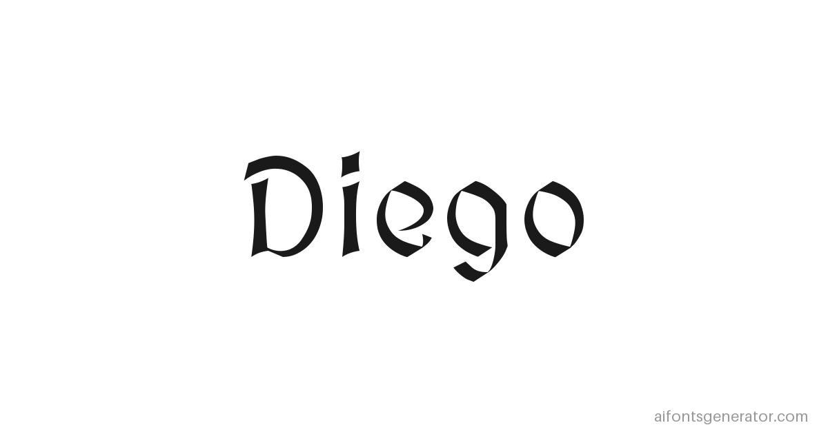
Script is what most people mean when they say chicano lettering — it's the look behind most searches for a chicano cursive font generator. Connected letters, long entry strokes, thick where the stroke pulls down and thin where it lifts. It turns up on shop walls, on lowrider show flyers, on quinceañera invitations, and on memorial pieces. Names and short phrases suit it. Anything past four or five words starts to congest. On this page the category covers Brock Script, Pinyon Script, Great Vibes, Style Script, and Mrs Saint Delafield. That last one has the loosest hand of the five and reads closest to something drawn rather than typed.
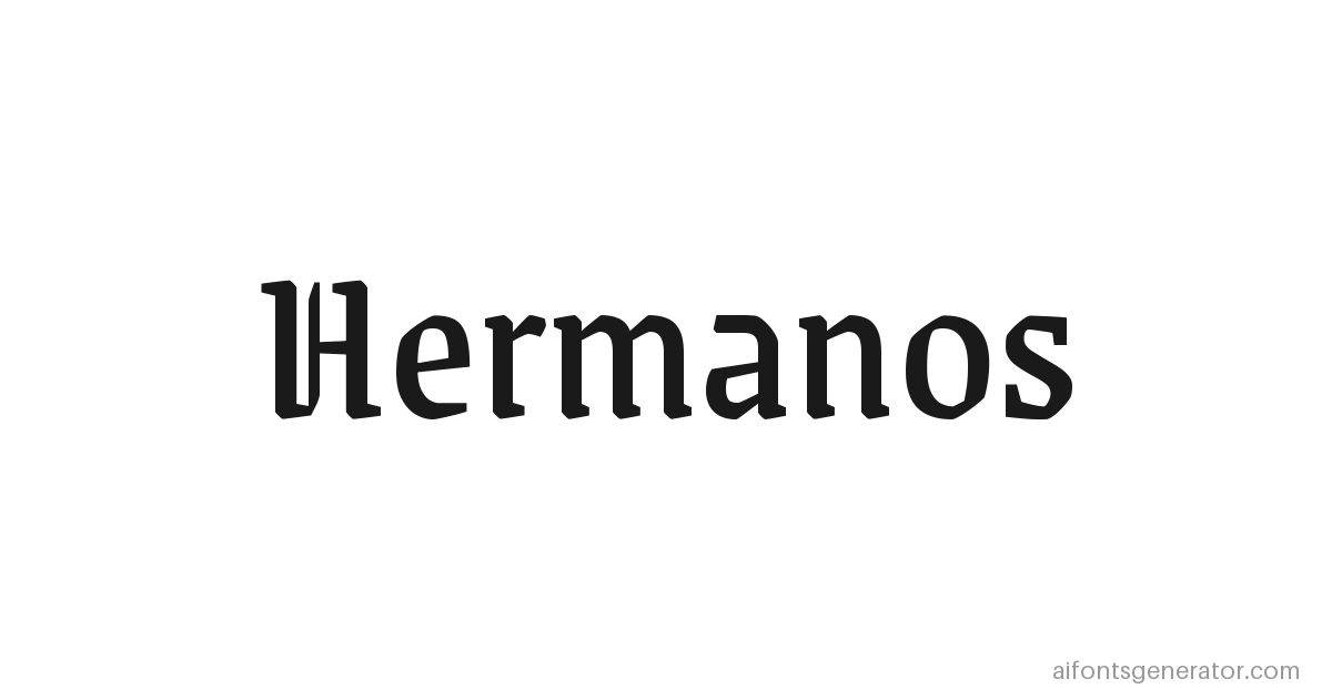
Blackletter is angular and dense, medieval European at the root, reshaped through decades of Mexican American tattoo and mural work. Jersey lettering uses it. So do neighborhood murals, album covers, and knuckle sets where you get one letter per finger and no room to be delicate. Single words carry it best: a surname, a city, a street name. The fonts here are Unifraktur, Dragonwick, Pirata One, Grenze Gotisch, and Medieval Sharp. Pirata One is the most open of them, which matters on longer words, because tight blackletter at length turns into a picket fence. If you want the European root on its own, without the Mexican American reworking, the gothic fonts page covers that separately.
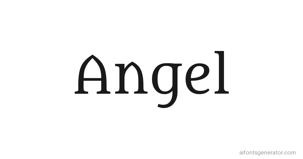
Ornate is the ceremonial end of the range. Elaborate capitals, flourishes hanging off the terminals, weight that suits a certificate or an invitation more than a forearm. Most people use it for one letter, usually an initial anchoring a larger design, or for the first character of a name set in something plainer. Eagle Lake, Cinzel, Almendra, and Metamorphous sit in this category. Cinzel is the most restrained of the four and the only one I would set a whole word in.
Fine line is thin strokes and minimal shading, the single needle look that dominates modern LA chicano work. Small wrist pieces, collarbone script, anything that has to stay legible at two inches wide. Crimson Italic, Sacramento, Tangerine, and Zeyada live here. Tangerine is the thinnest of them, which makes it the one to test hardest with the age slider, because hairlines are the first thing to go.
Some letters in the chicano alphabet carry more flourish than others. S, R, G and M hold natural curves and open counters, which gives the entry and exit strokes room to run. I, L and T stay plain because the line has nowhere left to travel. People search for single chicano letters more often than full words. An initial can anchor a larger piece, or someone simply wants to see how one letter of a name will sit before locking in the rest. Typing a single character into the generator produces the same rendering as a full name, so the one-letter preview is enough.
Chicano tattoo font generator
A font that looks sharp on a screen is not the same object as a design that holds up on skin. Screens are flat, backlit, and permanent at 100% zoom. Skin moves and stretches, and it pushes ink sideways by close to a millimeter in every direction over a decade. Hairline strokes that look precise on a monitor can close up and go soft.
Chicano tattoo lettering evolved around exactly that. Single needle work lays a thin consistent line with almost no shading, which is why the tradition leans on the shape of a letter rather than the mass of it. The elegance comes out of proportion and flourish, because heavy fill was never really available.
Spacing is where most digital previews mislead people. Tightly connected cursive looks beautiful at 1200 pixels wide. On a forearm, at actual size, ten years in, the joints between letters can fill and the word turns into one continuous mark. Chicano script survives this better than a lot of cursive because the connecting strokes sit high and stay thin, but it still deserves a check.
That is what the Tattoo Age slider is for. Push it to 60% and watch which styles hold their shape and which ones fall apart. A font that goes unreadable there has told you something no static preview ever will.
Skin tone belongs in the same conversation. Black ink reads differently on light, medium, and deep skin. Gold and white differ far more than people expect, and white ink on deep skin barely registers at all.
The exported PNG carries the font name, the ink color, the remix and age percentages, and the seed in the metadata strip. An artist who opens that file knows what they are looking at without you having to explain it.
Chicano Script Fonts
Spencerian and copperplate penmanship sat in American classrooms through the early 1900s. Business colleges taught the system so clerks could write ledgers fast and legible. The flexible steel nib did the real work. Pressure on the downstroke spread the tines and laid a thick mark. Release on the upstroke let them close and produce a hairline. That single mechanical fact is why thick-to-thin transitions exist at all.
Chicano script inherited the contrast even after the tool changed. A tattoo machine has no flex, yet the same rhythm of heavy downstrokes and light connectors stayed. The letterforms still show the memory of the nib.
Ordinary cursive and wedding calligraphy stay even and decorative. Loops close on themselves and the stress remains mild. Chicano script pushes the contrast harder. Entry strokes arrive sharp, exit strokes terminate instead of circling back, and the whole word carries a tighter, more directional energy.
Not every name wants that treatment. Short names with balanced ascenders and descenders connect cleanly. Long strings of rounded letters lose the rhythm. Names that already contain natural joining points (the r-to-n, the o-to-n) sit more comfortably in script than names built from isolated uprights.
The heavier sibling of the same tradition is gangster lettering.
Gangster chicano lettering
What reads as gangster is mostly weight and angle. Stroke mass increases, terminals sharpen, counters tighten, and the stress axis tips more aggressively. The same underlying construction that produces chicano script simply gets loaded with more ink and less air. Counter size drops so the open spaces inside letters shrink. Terminals lose their soft exits and end in hard points or abrupt cuts. The stress axis rotates further off vertical. X-height stays relatively high against the ascenders, which packs the mass into a denser block rather than letting it stretch tall and thin.
The look formed on the West Coast. Lowrider car clubs lettered plaques and shop windows. Prison artists drew on handkerchiefs and envelopes with whatever ballpoint the commissary stocked. By the nineties the same letterforms appeared on West Coast hip hop album covers. The history is continuous lettering practice across those surfaces, not a costume. Plaque conventions carried over directly: heavy black fills, tight negative space, and letterforms that sit as solid units rather than open calligraphy. Record sleeves kept the same stacked density and sharp terminals so the type still read at arm's length on a store rack.
Today the style shows up as tattoo reference sheets, streetwear and merch graphics, album and mixtape covers, and social media banners. It signals density and presence more than decoration. On dark fabric the mass holds. Fine-line script vanishes against black cotton or fleece once the ink sits under a layer of dye or print, but the heavier gangster forms keep their edges and still register as letters.
Inside the generator the blackletter category carries the weight best. Select classic black ink so the stroke sits at maximum density. Set the background to black velvet. Keep remix at zero. Any added ornament starts to chew into the mass and softens the terminals that define the look. Export comes out at 1280 by 800, which is enough for most digital layouts and print mockups.
Heavy letterforms close up at small sizes. Counters fill, terminals merge, and the word becomes a dark mass instead of readable type. On skin the breakdown starts once the letter height drops under roughly two inches. At that scale the reduced counters fill with ink or scar tissue and the sharp terminals blur together. The style works for headers, large artwork, and tattoo pieces that stay well above two inches. It fails for body text or any setting that demands legibility under pressure.
Chicano text styles you can copy and paste
The canvas previews produce an image you download. The unicode styles produce text you paste.
That difference matters more than it sounds. When you copy 𝒮ℴ𝒻𝒾𝒶 into an Instagram bio, you are not installing a font and Instagram is not rendering one. Those are Unicode characters that have existed in the standard for years, originally added for mathematical notation. Your phone already knows how to draw them. That is why they survive a paste into WhatsApp, TikTok, Discord, or a YouTube channel name.
Same name across the clusters so you can compare:
There are more than twenty styles on the page. Those are the ones that hold up best at small sizes.
Artist Framing is a toggle that wraps whatever you typed in ornaments taken from tattoo convention, the crosses and dots and flourishes an artist would set either side of a name. Sofia becomes ⁘ 𝒮ℴ𝒻𝒾𝒶 ⁘ or ☩ 𝔖𝔬𝔣𝔦𝔞 ☩. Those framing characters copy across with the text, so what lands in the paste is what you saw on screen.
What makes this different from other font sites
Most chicano font pages land in one of two buckets. Font directories give you a file to download and install, and you still need Photoshop open before you can see your own word in it. Text generators swap your letters for Unicode characters and stop there.
Everything below is checkable in about thirty seconds on this page.
- You see your word, not a sample. Every preview renders the exact text you typed. No pangram, no alphabet sheet, no "The quick brown fox."
- The preview is built as a proof sheet. Font name, ink color, and background run across the top. Remix percentage, tattoo age, ink style, resolution, and seed run across the bottom. Print registration marks sit at the corners. An artist can read the specs straight off the image.
- Skin preview at three tones. Type the name, switch the background to Skin, then move between light, medium, and deep. Black shifts. Gold and white shift a lot. I have not found another tool in this category that shows you that.
- Tattoo Age. Other previews show you day one. This one shows year five and year ten, ink spreading, hairlines breaking. That is the information that actually changes which font somebody picks.
- Transfer Paper. The purple stencil background is not a decorative filter. It is a real stage of the process, the point where your design sits on your skin in thermal transfer before anyone starts, and it looks different there than it does on white.
- Seeded rendering. Same name, same settings, same image, every time. Download it today, download it again in March, and the files match. Tools doing random generation under the hood cannot promise that.
- Free without a wall. No account, no email capture before you see results, no watermark removal paywall sitting on top of the basic use.
Downloading and sharing your design
Download PNG exports at 1280x800, twice the display resolution of the on-page canvas. That headroom matters when somebody opens the file full screen on a phone, and it matters more when a studio prints it as a desk reference.
What people actually do with the file: send it to an artist over WhatsApp or Instagram DM ahead of a consultation, print it and bring it to the appointment, drop it into a merch or print on demand layout, or post four versions and ask which one to get.
The proof sheet layout is doing work in all of those. An artist who receives a bare screenshot has to guess at the typeface. An artist who receives this file can read the font name, the ink color, and how far the remix was pushed, then tell you what will and will not translate to skin.
There is no download on the unicode side. The Copy button puts the characters on your clipboard and you paste them wherever the text needs to live, whether that is a bio, a display name, a caption, or a username.
Rough rule: export the image when you need to show something to a person, copy the text when you need it to sit inside another app.
Common questions
What font is used in chicano tattoos?
There is no single font. Traditional chicano lettering is drawn by hand by the artist, not typed, and the letterforms shift with whoever is holding the machine. The closest commercially available equivalents are ornate cursive scripts and adapted blackletters, which is what this tool previews.
Is chicano lettering the same as Old English?
They share ancestry without being the same thing. Old English blackletter is the medieval European root. Chicano blackletter went through decades of Mexican American tattoo and mural work and came out with its own proportions and its own flourish patterns.
Can I use these chicano fonts commercially?
Yes. Every webfont on this page is OFL licensed, which permits free commercial use. The downloaded PNG can go into merch, print work, or client projects without buying a separate license.
How do I pick which style to get tattooed?
Script suits names and short phrases. Blackletter carries single impactful words. Ornate works for standalone initials. Switch to the Skin background at your own tone, then drag Tattoo Age forward to see how the style holds up over years, and take the PNG to your artist as a starting point.
Is this chicano font generator free?
Yes. Type a word, preview every style, and download PNGs at no cost. No account and no email required.
Will you add AI generated chicano lettering?
That is in development. The plan is an engine that generates actual chicano style artwork of your text rather than swapping fonts, and there is an email signup on this page for early access.
Marcus found his in about a minute. Sofia in smooth script, previewed on skin at his own tone, then dragged forward to year ten so he could see where the thin strokes would end up. He sent the PNG to his artist, who took it as a starting point and drew her own flourishes over the top, which is how it should work. The tool is not the tattoo. It is the thing that gets the picture out of your head and into the room with the person holding the needle.